Please rate Blank Bell Curve Template

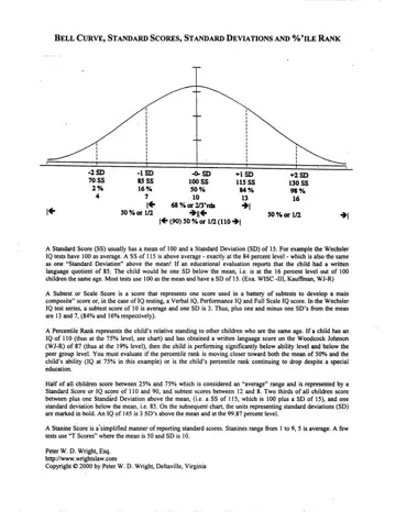
The bell curve, also called a Gaussian distribution, is a core tool in statistics and performance measurement. It maps how individual results spread around a central average called the mean. The shape of the curve depends on two factors: the mean, which marks the central peak, and the deviation measure, which controls how wide or narrow this blank bell curve form appears.
About 68% of measurements in a bell curve fall within one deviation band of the mean. Roughly 95% fall within two deviation bands, and 99.7% fall within three. This rule, known as the 68-95-99.7 rule or the empirical rule, holds true for any symmetrically spread data set. It makes the bell curve a reliable reference across fields as different as psychology, education, manufacturing, and finance. Choosing the right approach is easy when you understand how the data clusters around the mean.
In education, teachers use this blank bell curve form to identify which students score above, at, or below grade level. A class where 20 out of 30 students score between 65 and 85 on a 100-point test shows a bell curve clustered around a mean of about 75. Students scoring above 90 or below 50 fall outside one deviation band and may need enrichment or remediation. Tracking this information over multiple terms helps teachers choose appropriate instructional strategies and compare class performance year over year.
In HR, managers apply the bell curve to rank employees into performance tiers. A common model uses five levels: top 10%, above average 20%, core 40%, below average 20%, and bottom 10%. Using a bell curve for this process ensures that ratings reflect the statistical pattern of actual performance rather than subjective bias. Managers who double-check results against prior review cycles can identify whether a team’s performance is improving or becoming less variable over time.
In manufacturing, quality analysts track defect rates and output consistency using bell curve models. A process running within three deviation bands of its target mean meets the standard for six-sigma quality, allowing only 3.4 defects per million outputs. A tall, narrow bell curve signals high consistency. A wide, flat bell curve reveals high variability that may require process corrections. Recording this data in a structured form and comparing the number of defects across production runs makes it easy to spot process drift early.
Natural and organizational measurements tend to follow a bell curve when sample sizes are large and no single factor dominates the outcome. Physical measurements such as height, weight, and reaction time cluster symmetrically around a central mean. Academic test scores, IQ assessments, and standardized examination results show the same bell curve pattern across large populations. Financial data including daily index fund returns and salary figures across large companies approximate a bell shape over long periods. Keeping a structured performance progress report over several review cycles makes it easier to identify whether your data set follows a bell curve before plotting.
Data sets with hard floors or ceilings, such as pass-fail grades or zero-bounded income figures, skew and require a different model. In those cases, a log-normal or skewed curve provides a more accurate fit than the standard bell shape. Response times for customer service tickets and patient recovery durations in clinical studies frequently follow a right-skewed bell curve because a minimum time exists but no hard ceiling does. Recognizing these bell curve patterns before you begin plotting prevents misinterpretation and ensures the correct statistical model is selected and applied consistently across all measurements. The blank bell curve form makes it easy to choose an appropriate visual representation once you know which model fits your data.
A symmetric bell curve indicates that values are spread evenly on both sides of the mean. A curve that leans to the left has a negative skew, meaning more scores fall above the mean. A curve that leans right has a positive skew, pointing to a concentration of lower values. Kurtosis measures whether the bell curve is taller and narrower or flatter and wider than a baseline bell curve. A leptokurtic bell curve has sharper peaks and heavier tails than the bell, meaning extreme values occur more frequently than expected. A platykurtic bell curve has a flatter peak and thinner tails, indicating that values spread more evenly across the range without clustering at the center.
Three practical checks help confirm whether a data set genuinely follows a bell curve before you rely on it for decisions. First, verify that the mean, median, and mode are equal or very close. In a true bell-shaped spread, all three measures of central tendency converge at the peak. Second, check for outliers by examining values that fall beyond three deviation bands from the mean. A single extreme value can distort the bell curve enough to make a bell-shaped pattern appear skewed. Third, plot your data as a histogram with equal-width bins and compare its shape to the overlaid bell curve. If the bars follow the curve closely, the bell-curve fit holds. When the curve shape deviates significantly from the expected bell, use an annual audit form to document the data collection process and identify sources of bias or measurement error. Reviewing the findings against an audit review form adds a second layer of verification before drawing conclusions. Use this blank form to record the information and compare your plotted data against the theoretical bell curve clearly.
| Question | Answer |
|---|---|
| Form Name | Bell Curve Chart with Standard Scores and Percentiles |
| Form Length | 1 pages |
| Fillable? | No |
| Fillable fields | 0 |
| Avg. time to fill out | 15 sec |
| Other names | blank bell curve printable template, blank normal curve, blank bell curve, editable normal distribution curve |
Blank Bell Curve Template isn’t the one you’re looking for?
Please rate Blank Bell Curve Template